Design
Core Shopping Experience
01
Homepage
Brand-first hero with a direct path to shop
Full-bleed hero, featured collection strip, and a single focused CTA.
02
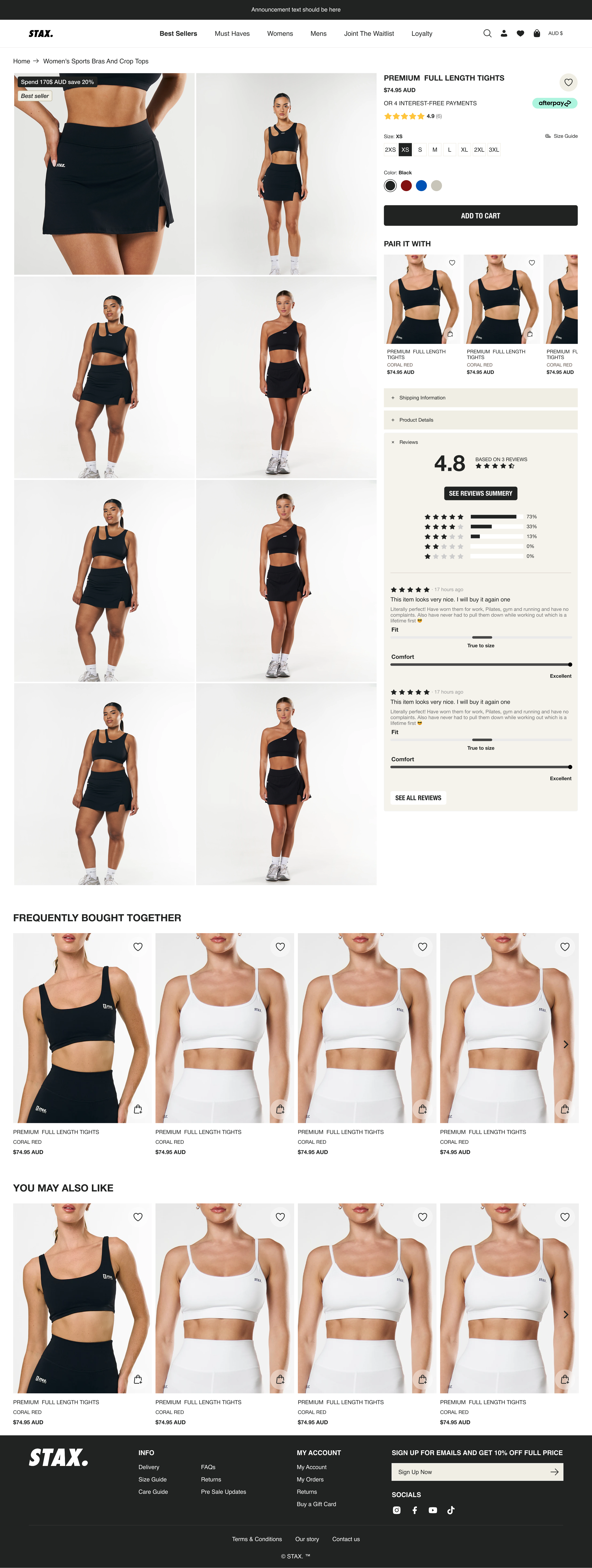
Product Page
Price, size, and add-to-cart above the fold
Key purchase actions surface first — no scrolling to decide.
03
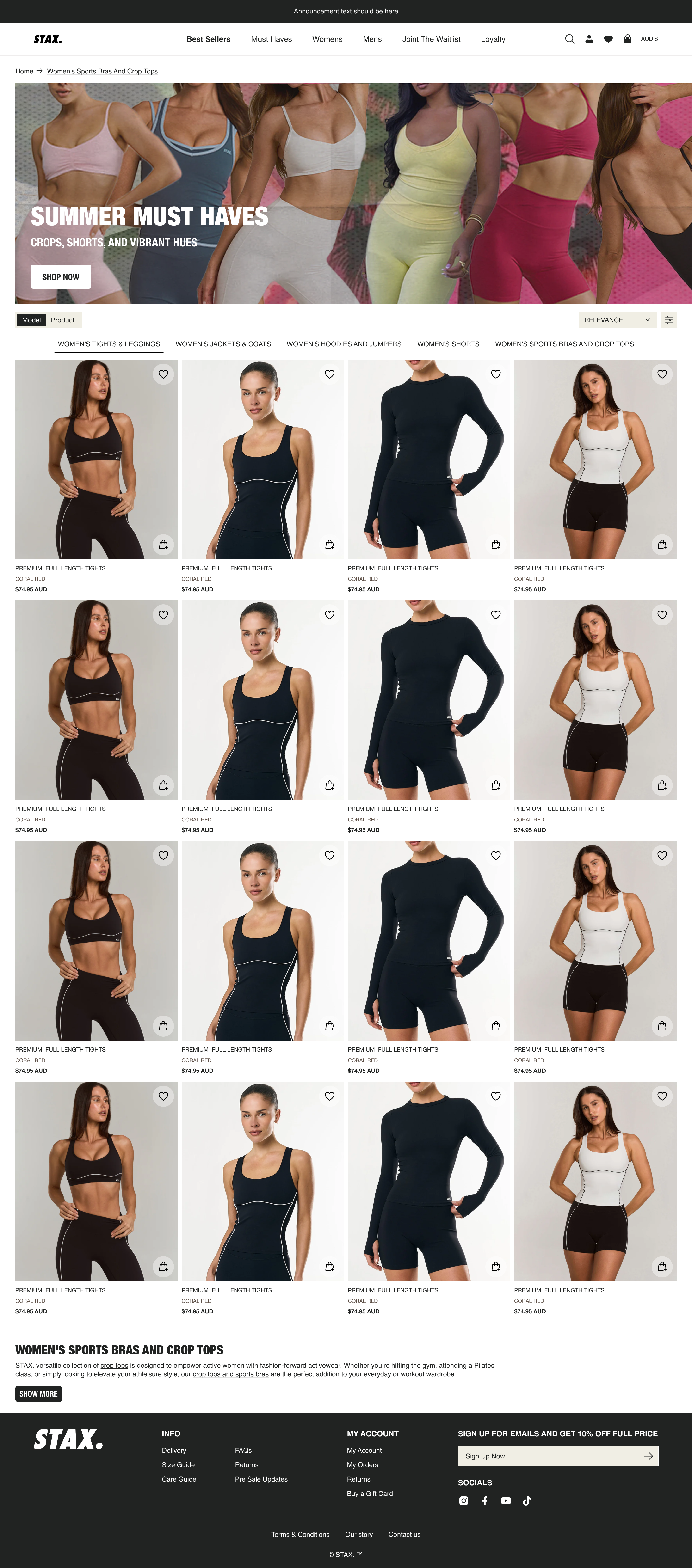
Collection Page
Denser grid, faster browsing
Tighter product cards with visible price and quick-add on hover.