Featured Case Study

FLEXXI — Healthcare Marketplace Ecosystem

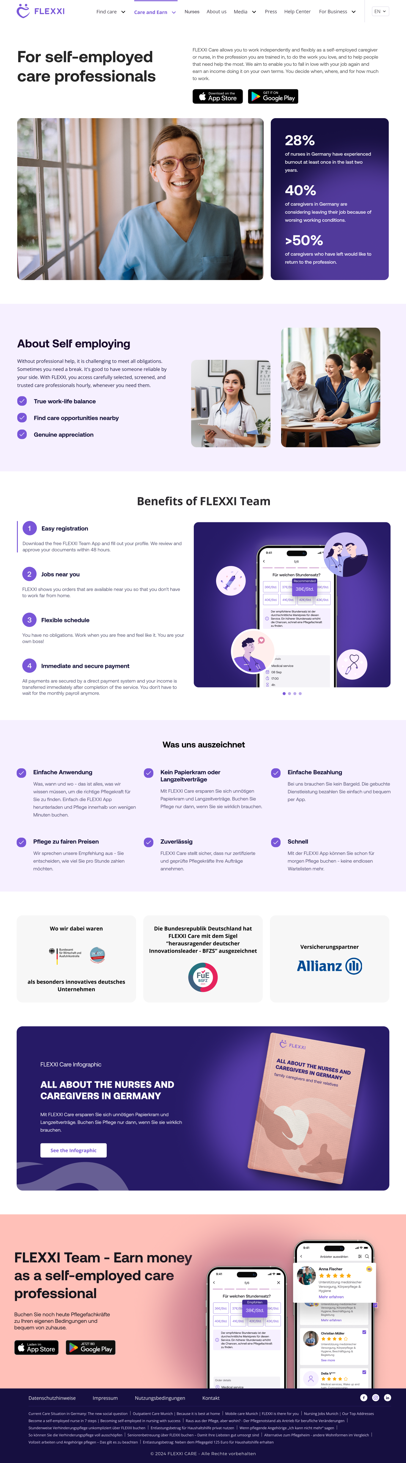
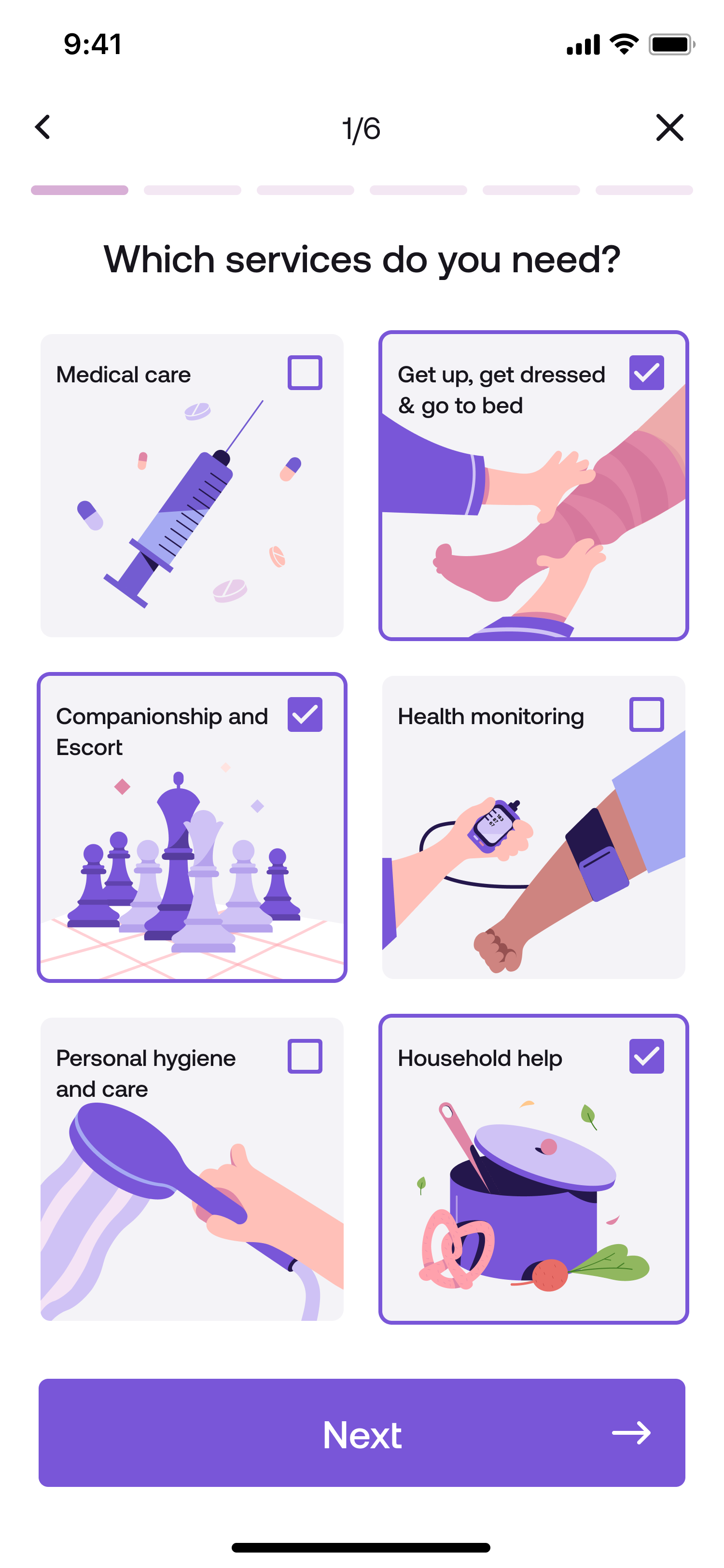
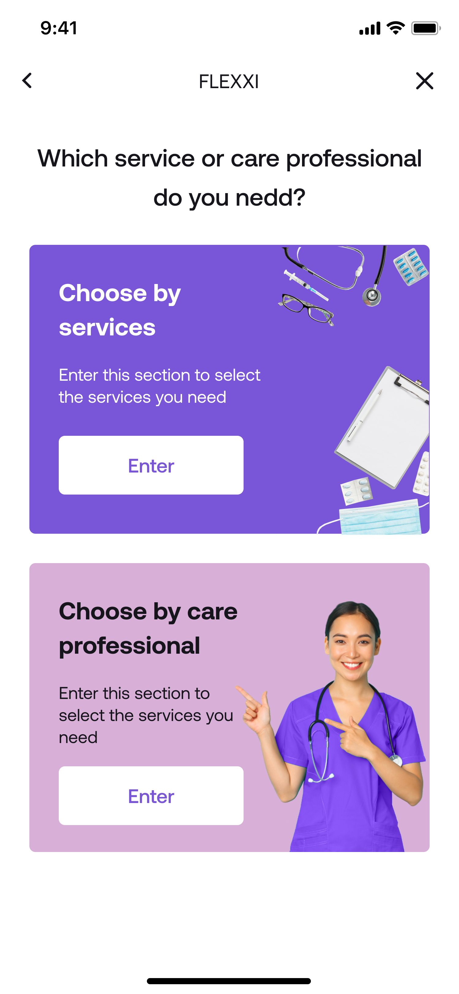
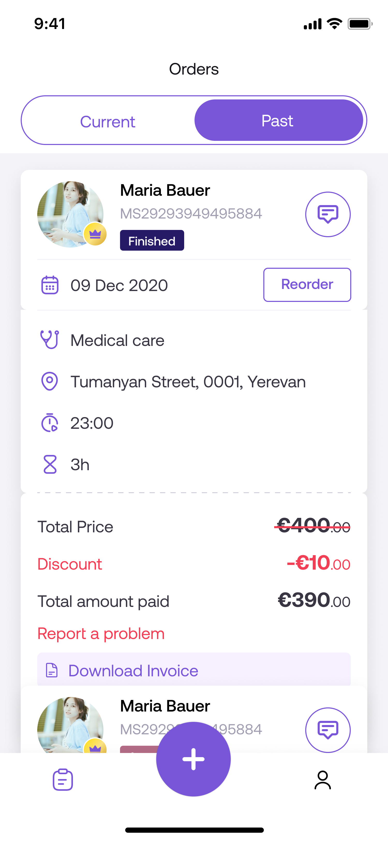
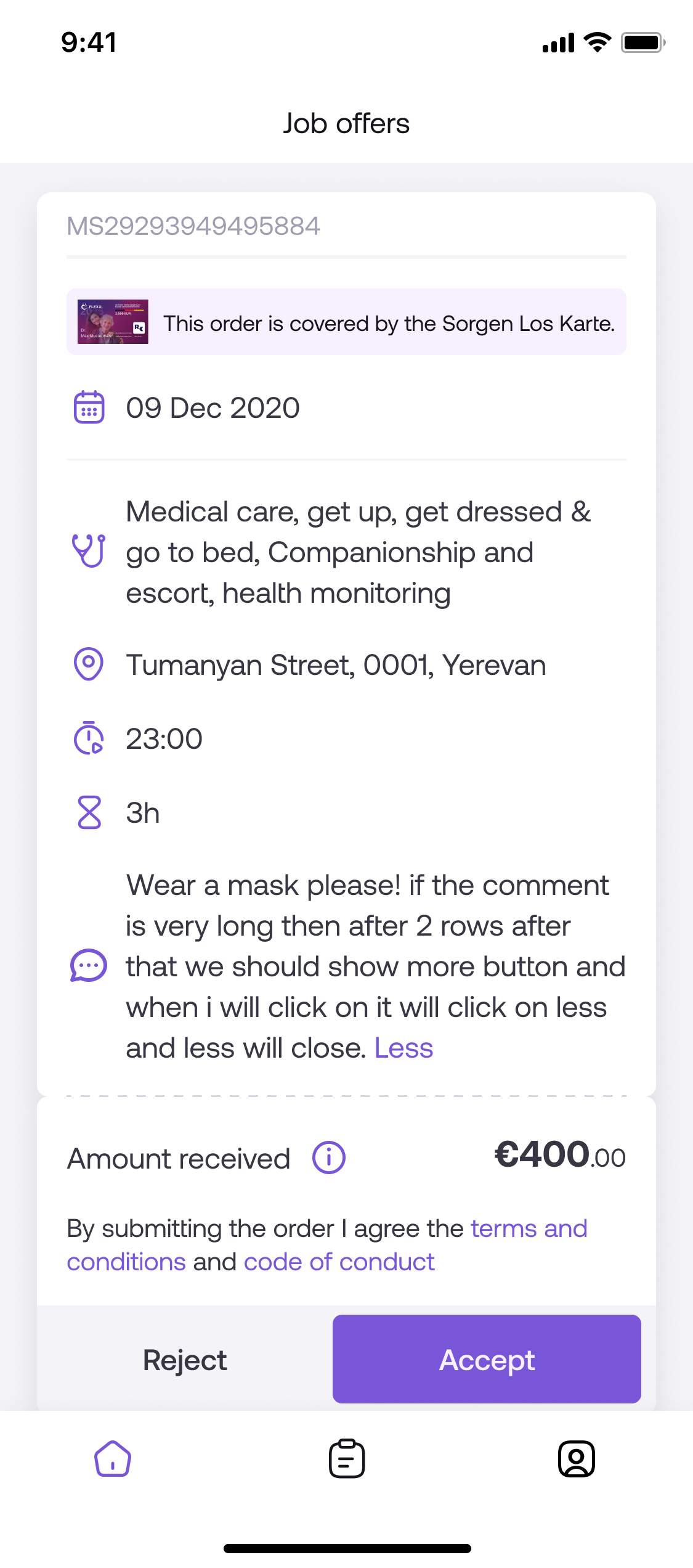
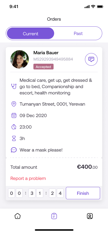
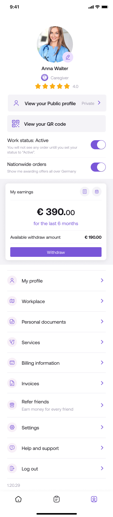
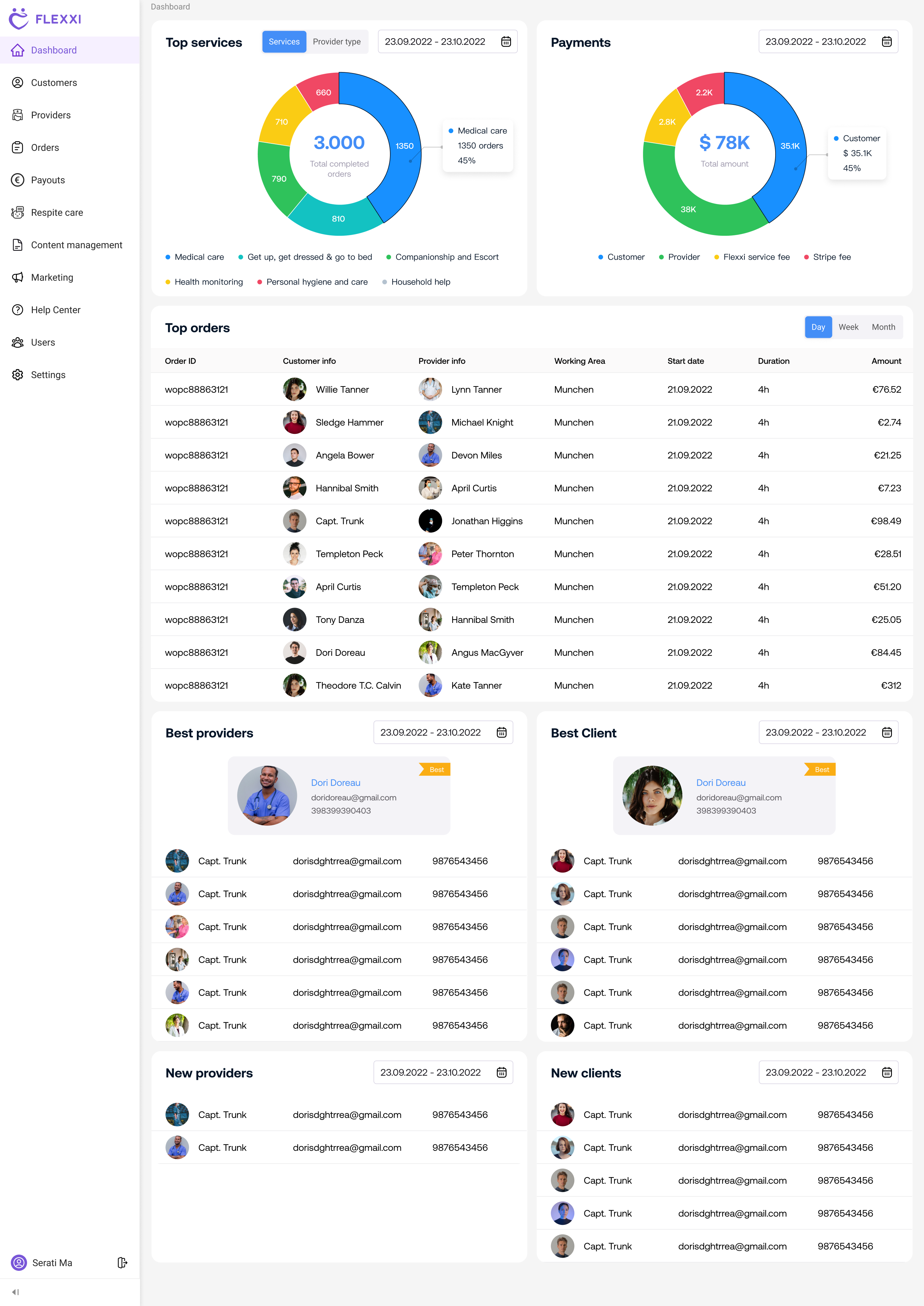
An early-stage healthcare startup connecting families with vetted caregivers. Embedded in the product team for five years, I shaped the platform from early concept through production — across web, mobile, an operations dashboard, and a conversational care assistant.

Project
Flexxi — Healthcare Platform
Role
Senior Product Designer
Focus
Dashboard UX · Caregiver Workflows · Mobile UX · Design Systems · Developer Collaboration
Outcome
Shipped production-ready interfaces across every platform — from the public site to internal operations tools.
Flexxi Care multi-platform ecosystem — web, mobile, and operational screens
Role Senior Product Designer
Duration 5+ Years
Environment Early-Stage Startup
Industry Healthcare · Caregiving
Scope Website · Mobile Apps · Dashboard · Care Assistant

One platform. Multiple products. Every touchpoint.

Flexxi is an early-stage healthcare startup connecting families with vetted caregivers across Germany. Embedded in the product team for five years, I worked directly with founders and developers — contributing to product strategy, designing across every platform, and taking work through to production-ready implementation. Every interface had to serve three completely different user groups while sharing one coherent underlying system.

01 — Challenge

Designing for three users.
One connected ecosystem.

Families needed trust. Caregivers needed speed. Operations teams needed control. Everything had to work together — across web, mobile, and internal tools — without compromising any one of them. In a startup environment, those decisions had to be made fast, with limited resources and evolving product requirements.

01

Families

Needed trust

Making emotional decisions about care. Every touchpoint had to feel safe, clear, and confident enough to act on.

02

Caregivers

Needed speed

Working on the go, often under pressure. Interfaces had to be fast, reliable, and instantly readable on mobile.

03

Operations

Needed control

Managing a growing marketplace at scale. Tools had to surface the right data and reduce manual effort at every step.

02 — Approach

How I worked through it.

Not a client engagement — an embedded partnership. Working directly inside the founding team meant contributing to product decisions, not just executing against a brief.

01

Audit existing workflows

Mapped user journeys across all three roles to identify friction, redundancy, and gaps in system logic before touching any UI.

02

Identify friction points

Synthesized research into a clear friction map — prioritizing problems by frequency, severity, and impact on user confidence.

03

Simplify multi-user flows

Designed role-specific experiences that felt simple from the outside while sharing a coherent system underneath.

04

Build scalable patterns

Defined reusable UI components and interaction logic early — foundations that held up as the product grew across platforms and years.

05

Iterate with developers

Stayed close to implementation throughout — working through technical constraints with engineers, refining specs iteratively, and making sure designs shipped as intended.

03 — Experience Design

Designing a multi-entry onboarding system

I designed onboarding flows across families and caregivers, handling multiple entry points (email, phone, social login) and complex edge cases.

  • Multiple entry points — email, phone, Google, Apple
  • Separate flows for families vs. caregivers
  • Edge cases mapped early to reduce drop-offs
Website

Marketing & Web Experience

Families in complex emotional situations make fast judgments about trust. Every page was designed to establish credibility immediately and guide users toward a confident first action — not just look polished.

flexxi.com
Flexxi Care — Homepage
flexxi.com/find-care
Flexxi Care — Find Care Flow
flexxi.com/caregivers
Flexxi Care — Caregiver Experience
Built for trust at first impression Conversion-focused information hierarchy Consistent design language across all entry points
Mobile Apps

Two apps. One care ecosystem.

Two distinct user types with completely different needs — families making high-stakes decisions calmly at home, and caregivers working fast under pressure. Each app had to feel purpose-built, while sharing a coherent visual and interaction language underneath.

Families can request support, compare care options, and manage bookings directly from their phone.

Find Care Choose Services Manage Bookings

Caregivers receive matched requests, manage active shifts, and track earnings in one simple workflow.

Incoming Offers Shift Management Earnings & Profile
Family app — Choose a caregiver
Family app — Book care
Family app — Manage booking
Caregiver app — Receive offer
Caregiver app — Complete shift
Caregiver app — Manage earnings
Admin & Operations

Admin & Operations Platform

The operations dashboard was designed to surface critical information first — booking status, caregiver availability, and escalation signals — without burying teams in data tables. The challenge was showing enough context for fast decisions while keeping the interface calm under high volume.

admin.flexxi.com / dashboard
Flexxi admin — analytics dashboard with charts and bookings overview
admin.flexxi.com / caregivers
Flexxi admin — caregiver and customer profile management
Caregiver & Customer Management
admin.flexxi.com / orders
Flexxi admin — orders and payments table
Orders & Payments
Grouped actions to reduce cognitive load Prioritized escalation visibility Created reusable dashboard patterns Simplified navigation across caregiver workflows
Chatbot

Smart Application
Assistant

Transforming a 200+ question healthcare form into a guided conversational experience

The Problem

Users previously had to complete a long PDF form with over 200 questions to access government healthcare support. The process was complex, confusing, and especially overwhelming for elderly users unfamiliar with bureaucratic systems.

Many eligible users never completed the process — and missed out on financial support they were entitled to.
The Solution

Guided Application Experience

A conversational assistant replaces a complex 200+ question form, guiding users step by step through a simplified and accessible process.

  • One question at a time
  • Reduced cognitive load
  • Clear and structured progression
"What used to feel like paperwork now feels like a conversation."

Key Design Decisions

01

Break Complexity into Steps

200+ questions transformed into small, manageable interactions.

02

Conversational UX

Replaced traditional forms with a guided, human-like interaction.

03

Progressive Disclosure

Only relevant information is shown at the right moment.

04

Emotional Design

Friendly assistant reduces stress and builds trust for elderly users.

Impact

Reduced perceived complexity of the application process
Made the system accessible for elderly and non-technical users
Increased likelihood of form completion
Transformed a bureaucratic process into a guided experience
"What used to feel like paperwork now feels like a conversation."
Product Environment

Working inside a startup team.

Flexxi wasn't a client project or a spec exercise — I was embedded in the founding team. That meant contributing to product direction, designing under evolving requirements, and staying close enough to implementation that decisions actually held in production.

Startup Environment Figma Developer Handoff Product Strategy Healthcare UX

Direct collaboration with developers — translating designs into production specs and iterating through technical constraints

Adapted to evolving product requirements as business priorities shifted across five years of growth

Production-level ownership — responsible for implementation accuracy, not just visual quality

Built design patterns that scaled with the platform as it grew in complexity, user volume, and product scope

— Impact & Outcomes

What this work delivered.

01

Workflow Clarity

Complex multi-user healthcare processes simplified into clear, navigable interfaces — reducing decision friction across all three user types.

02

Reduced Interface Complexity

Consolidated overlapping UI patterns into a unified system — fewer inconsistencies, faster shipping, lower maintenance overhead.

03

Accessible Healthcare UX

Transformed a 200+ question government form into a guided conversational experience accessible to elderly and non-technical users.

04

Scalable Design Patterns

Built reusable component foundations the team could extend independently — design decisions that held up across years, not just sprints.

05

Startup Product Velocity

Maintained pace with a fast-moving founding team — adapting quickly to shifting requirements while keeping quality and consistency across every platform.

06

Production-Ready Execution

Stayed close to implementation throughout — iterating directly with developers to close the gap between design intent and what shipped in production.

Five years of embedded product work.

Working inside Flexxi long-term shaped how I approach design at scale. Consistency across multiple platforms doesn't happen by accident — it requires systems thinking, direct collaboration with developers, and the discipline to build patterns that hold up across years of product evolution. Being embedded in an early-stage team meant owning the design process end-to-end, from early product strategy through to shipped, production-ready interfaces.

5+ Years Active
4 Product Areas
3 User Groups

Let's build something worth using.

Available for senior design roles, long-term product partnerships, and freelance engagements.